Now this is clever. Good job.
Lame, lameish… :-(
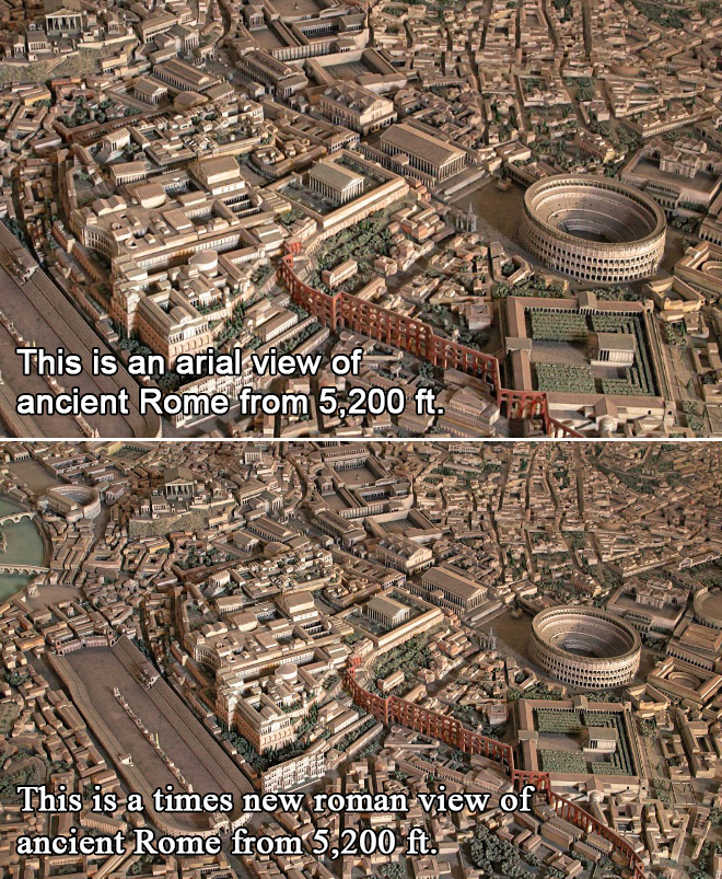
Why does the images look different even when the altitude is the same????
New Times Roman used a wider angle lense than Arial. Same distance, wider field of view.
Fonts. Dhhhh.
Casual even to the most obvious observer.
Because it’s a MODEL!
It would have been funnier in Comic Sans.
Light it on fire. There, you have it.
If by clever you mean stolen, then you are correct sir!
Comment
Δ

Now this is clever.
Good job.
Lame, lameish… :-(
Why does the images look different even when the altitude is the same????
New Times Roman used a wider angle lense than Arial. Same distance, wider field of view.
Fonts. Dhhhh.
Casual even to the most obvious observer.
Because it’s a MODEL!
It would have been funnier in Comic Sans.
Light it on fire. There, you have it.
If by clever you mean stolen, then you are correct sir!