Times New Roman and Helvetica are good fonts and classics. So called bread-and-butter types. They are always good to use. So, leave them alone. Wannabe designers don’t know their stuff in typography.
1
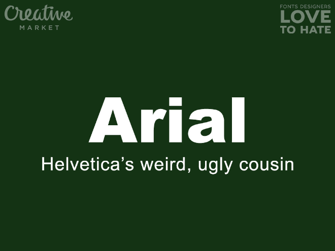
I’ve used Arial for years, even when people requested things in Times New Roman. It’s completely and utterly plain, which is good for just about every professional purpose. So it doesn’t look like it was hand-lettered by monks. Great. I don’t want that when I want my words to do the talking and my pretentious arty side to sit down and shut up.
1
Hey, they forgot me, Impact, the meme best friend!
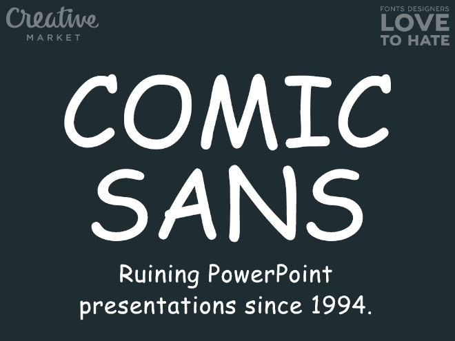
Comic Sans and PowerPoint are soulmates. They’re made for each other. Like flies and dung.
The best font I’ve ever come accross is Garamond Simoncini, specially realised for Einaudi, an important Italian publisher. In comparison Times New Roman looks like Cinderella’s ugly sister.
Arial is a font for the real men. Designers wouldn’t understand it.
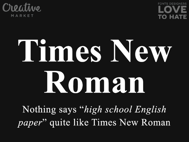

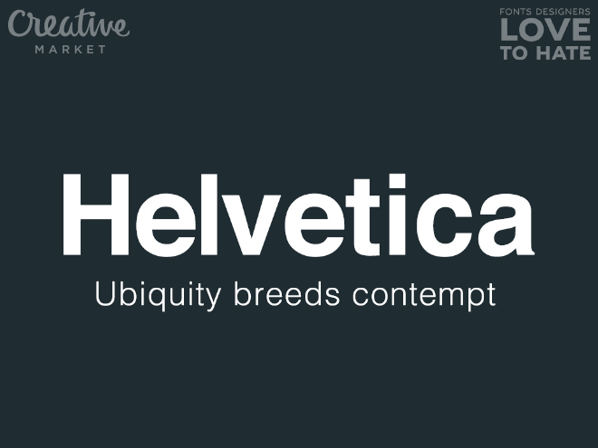

Times New Roman and Helvetica are good fonts and classics. So called bread-and-butter types. They are always good to use. So, leave them alone. Wannabe designers don’t know their stuff in typography.
I’ve used Arial for years, even when people requested things in Times New Roman. It’s completely and utterly plain, which is good for just about every professional purpose. So it doesn’t look like it was hand-lettered by monks. Great. I don’t want that when I want my words to do the talking and my pretentious arty side to sit down and shut up.
Hey, they forgot me, Impact, the meme best friend!
Comic Sans and PowerPoint are soulmates. They’re made for each other. Like flies and dung.
The best font I’ve ever come accross is Garamond Simoncini, specially realised for Einaudi, an important Italian publisher. In comparison Times New Roman looks like Cinderella’s ugly sister.
Arial is a font for the real men. Designers wouldn’t understand it.
Amen